Selena Ando
Context
Design Methods Class Project @ University of Washington
Deliverables
User Persona
Affinity Diagram Maps
Low to High Fidelity Wireframes
High Fidelity Prototype
MVP
Video Presentation
Tools & Concepts
Figma
Whimsical
Kapwing
Google Forms
Zoom
Role
UX Designer & Reseracher
Problem Context & Secondary Research
COVID-19 Pandemic Highlights the Inaccessibility of Mental Health Care
The pandemic introduced new stressors and exacerbated existing ones for many, emphasizing the importance of having healthy support systems and accessible care options to manage mental well-being during challenging times. However, our team simultaneously noticed a growing conversation on social media regarding university students vocalizing concerns over obstacles to care (i.e. offices being closed due to staffing shortages, long wait times for online appointments, etc.) and wanted to investigate this problem further.
17+ Literature Sources Analyzed
Reveals widening gap between supply & demand of mental health services for college students, especially after COVID-19

The Struggle is Real
Writing for websites is both simple and complex. On the one hand, all you need to do is say what you mean and in your words.
Expontential Increase in Demand for Help
Last year, health professionals saw the largest increase
- 10% increase in demand for anxiety disorder treatment
- 14% increase in demand for depressive disorder treatment

Professionals Unprepared to Meet Rising Demands
- 30:100,000 psychologists to people ratio
- 40% of psychologists are “unable to meet demands for treatment”
- 1/2 of psychologists report burn out from post-pandemic demands
Primary Research & User Validation
User Survey Validates Secondary Research Findings
An anonymous Google Forms survey regarding students’ attitudes towards the University of Washington’s current mental health resources was distributed to both undergraduate and graduate students until responses reached saturation. The survey was distributed among our community due to the sensitive nature of mental health. Qualitative responses were organized into an affinity diagram, while Quantitative data was interpreted using Google Forms analytic tools.
Key Insights
Mismatch of Needs
Students desire ongoing and regular sessions but the University sets a maximum limit available
Personal Barriers
- Financial Burden
- Poor Insurance Coverage
- Personality Mismatches
- Scheduling Conflicts
Resource Shortage
- 1:2500 Staff to student ratio
- Wait times upwards of 2-3+ Weeks
There’s No Need to Reinvent the Wheel
Primary and secondary research revealed that there is already an abundance of resources. Instead of creating a new solution entirely, we must investigate if, why, and how user needs are not being met with preexisting solutions.
How might we...
Bridge the gap between supply and demand of mental health resources for the University of Washington’s undergraduates in a way that complements existing resources, is responsive to urgency, and is inclusive of various needs?
Ideation


Of possible ideas, two common themes stood out
Mobile App is the most accessible modality
- Location & time independent, perfect for busy students
- Offers an asynchronous option for a more private approach
Approaches must be diversified
- Individuals approach mental health in very personal ways
- Options beyond the typical talk session, such as relaxing games, meditation, etc.
Concept validation via AB Testing
Feedback
💭 Certain features are triggering due to similarity with social media, such as Profile Customization and Discussion Board
💭 Low Stakes Activities are great! Feels inclusive of those who prefer a more private approach, and increases coverage of approach options
💭 Gray scale color palettes and dreary colors feel depressing
💭 Sensitive health information raises privacy and data misuse concerns
Semi-Structured 45 Minute Interview Combined with a Cognitive Walk-through of 2 Low-Fidelity Prototypes
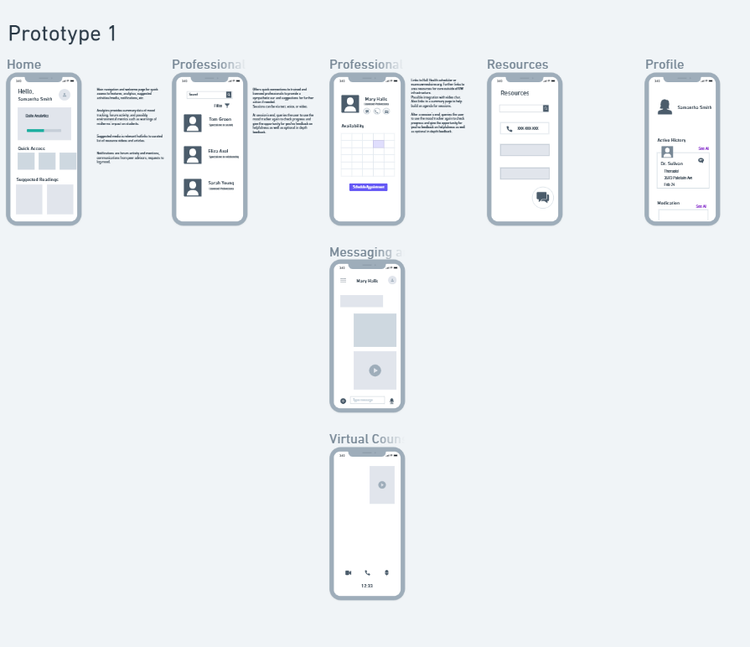
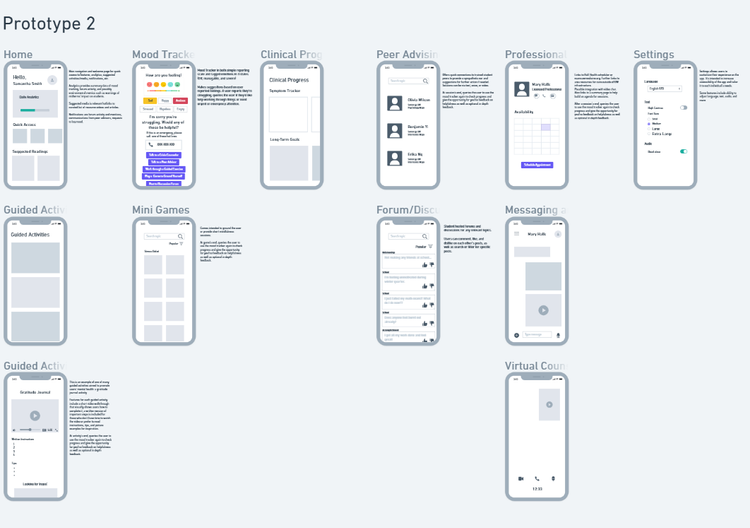
For concept validation, we introduced our participant to two low-fidelity prototypes and asked them usability questions and how they might approach each prototype’s features, if any. Pictured on the left is prototype 1—it’s only feature is to directly message, schedule an appointment, or call a mental health professional and peer advisor. Meanwhile, prototype 2 on the right features a more comprehensive approach with both self-paced, asynchronous activities and synchronous care options.
Limited Participants Due to Sensitive Nature of Mental Health
As a heavily stigmatized and personal topic, we deemed recruiting representative users only in our closest communities most appropriate instead of openly recruiting on campus or online. With limited time and pool of candidates, we found only one participant comfortable partaking in our research.
AB testing demonstrated pros and cons of both prototypes. We decided to cherry-pick the best features from each prototype, while adding new features to address privacy and data concerns.
Key Design Decisions
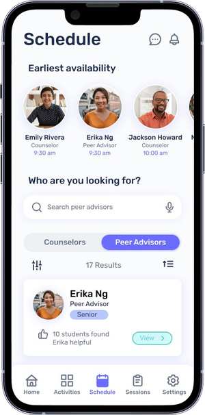
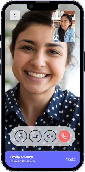
Options for self, peer, and professional help
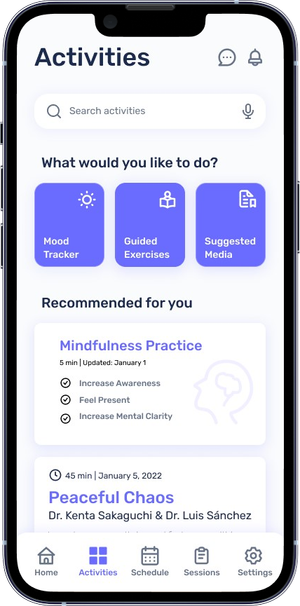
People experience, process, and heal from mental health challenges in different ways. As there is no set path to recovery, we worked to diversify the type of support available so all students can choose their best fit. In addition to the traditional professionals, users can leverage their peers or engage in individual activities on their path of recovery. These represent a lower barrier to entry, and oftentimes encourage users to engage where they might otherwise not due to the daunting nature of a professional.
Easily Access and Visualize a Comprehensive Hub of Resources
Resource hubs are often overwhelming and unapproachable for newcomers. The sheer number of resources offered makes navigation incredibly daunting, often turning many away from trying at all. Dubcare is intentionally designed with simple, distinctive groupings to make navigation intuitive and straightforward. Instead of prioritizing resource volume, we offer a carefully curated selection to simply the entire process of getting help.
Responsive to Urgent Needs
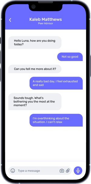
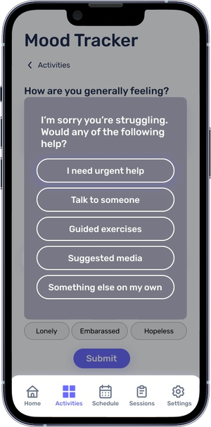
Upon entering the application, users can find a chat icon to immediately talk with professionals and peers for urgent help. Emergencies happen, especially as mental health can be unpredictable. Offering a method to instantly reach out for help minimizes the time spent waiting, minimizing the possibility of spiraling.
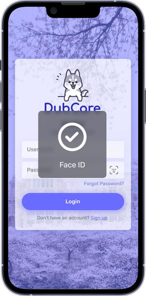
Two-Factor Authentification to Protect User Privacy
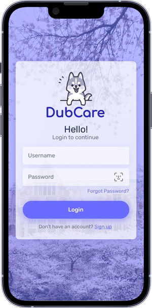
Health data is inherently sensitive and personal to our users. To protect their sensitive health data, two factor authentication is required in order to login to the app.
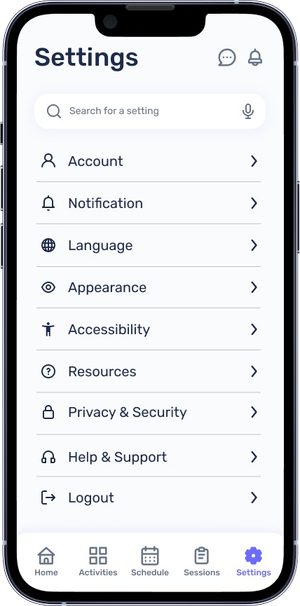
Full Control over your Data through Privacy Settings
Full transparency allows users to see exactly what data is being collected about them, giving them the choice to either retain or remove their data. Having this agency establishes a bond of trust between app and user, that their personal data won’t be taken advantage of for profit or other nefarious reasons.
Limitations
Bound to Restrictions of UWCC’s System
Dubcare is intended to complement the University of Washington’s Counseloig Center (UWCC)’s existing services. It is consequently bound to its existing policies and limits functionality for students who are receiving treatment outside UWCC or UW medicine. As this is a restrictive userbase, expansion will require a significant amount of re-tooling and a total redesign of systems.
Furthermore, UWCC materials (verbal & written) are exclusively in English, severely limiting language accessibility. As a large portion of the student body at the University of Washington is international, a significant portion of users may not be able to fully utilize the resources and services.
Possible Strain on UWCC
Dubcare relies on UWCC resources and architecture. If the app experiences sudden high adoption, UWCC systems may not be able to accomodate the large influx of users, requiring complex infrastructure and software updates. This would not only impact Dubcare users, but individuals who already leverage UWCC’s services.
Final Solution
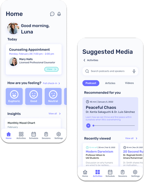
Dubcare
Mental Health Care Your Way
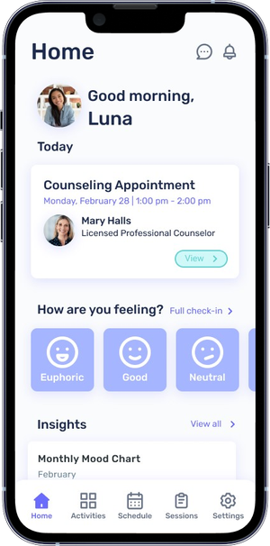
Synchronous Care Options
Asynchronous Care Options
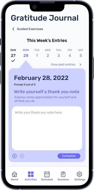
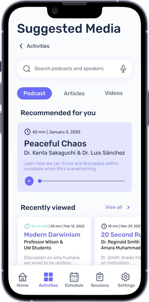
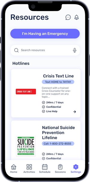
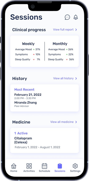
Track Your Journey
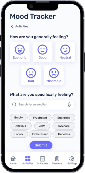
Personalized to Your Needs
Private & Secure
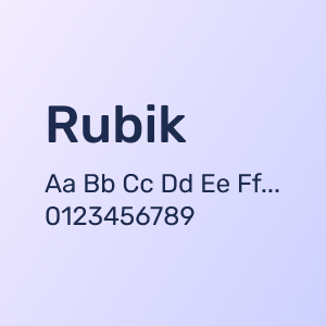
Rubik Font
We wanted our app to feel inviting and not overly
stimulating, so we chose a clean, moderately
rounded sans serif font.
UW Husky Mascot Logo
A cute depiction of a friendly & inviting dog improves our app approachability by making mental health care feel
less overwhelming.
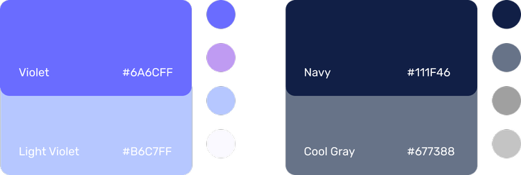
Modern and Soft Purple Colors
Our target audience is UW students who are mostly
in their late teens or 20s, so we chose a color palette
that’s modern and matches UW’s theme colors.
Given the topic of our app, we were careful to
choose colors that weren’t too vibrant or
overwhelming.
Selena Ando
Context
Design Methods Class Project @ University of Washington
Deliverables
User Persona
Affinity Diagram Maps
Low to High Fidelity Wireframes
High Fidelity Prototype
MVP
Video Presentation
Tools & Concepts
Figma
Whimsical
Kapwing
Google Forms
Zoom
Role
UX Designer & Reseracher
Problem Context & Secondary Research
COVID-19 Pandemic Highlights the Inaccessibility of Mental Health Care
The pandemic introduced new stressors and exacerbated existing ones for many, emphasizing the importance of having healthy support systems and accessible care options to manage mental well-being during challenging times. However, our team simultaneously noticed a growing conversation on social media regarding university students vocalizing concerns over obstacles to care (i.e. offices being closed due to staffing shortages, long wait times for online appointments, etc.) and wanted to investigate this problem further.
17+ Literature Sources Analyzed
Reveals widening gap between supply & demand of mental health services for college students, especially after COVID-19
The Struggle is Real
Writing for websites is both simple and complex. On the one hand, all you need to do is say what you mean and in your words.
Expontential Increase in Demand for Help
Last year, health professionals saw the largest increase
- 10% increase in demand for anxiety disorder treatment
- 14% increase in demand for depressive disorder treatment
Professionals Unprepared to Meet Rising Demands
- 30:100,000 psychologists to people ratio
- 40% of psychologists are “unable to meet demands for treatment”
- 1/2 of psychologists report burn out from post-pandemic demands
Primary Research & User Validation
User Survey Validates Secondary Research Findings
An anonymous Google Forms survey regarding students’ attitudes towards the University of Washington’s current mental health resources was distributed to both undergraduate and graduate students until responses reached saturation. The survey was distributed among our community due to the sensitive nature of mental health. Qualitative responses were organized into an affinity diagram, while Quantitative data was interpreted using Google Forms analytic tools.
Key Insights
Mismatch of Needs
Students desire ongoing and regular sessions but the University sets a maximum limit available
Personal Barriers
- Financial Burden
- Poor Insurance Coverage
- Personality Mismatches
- Scheduling Conflicts
Resource Shortage
- 1:2500 Staff to student ratio
- Wait times upwards of 2-3+ Weeks
There’s No Need to Reinvent the Wheel
Primary and secondary research revealed that there is already an abundance of resources. Instead of creating a new solution entirely, we must investigate if, why, and how user needs are not being met with preexisting solutions.
How might we...
Bridge the gap between supply and demand of mental health resources for the University of Washington’s undergraduates in a way that complements existing resources, is responsive to urgency, and is inclusive of various needs?
Ideation
Of possible ideas, two common themes stood out
Mobile App is the most accessible modality
- Location & time independent, perfect for busy students
- Offers an asynchronous option for a more private approach
Approaches must be diversified
- Individuals approach mental health in very personal ways
- Options beyond the typical talk session, such as relaxing games, meditation, etc.
Concept validation via AB Testing
Semi-Structured 45 Minute Interview Combined with a Cognitive Walk-through of 2 Low-Fi Prototypes
For concept validation, we introduced our participant to two low-fidelity prototypes and asked them usability questions and how they might approach each prototype’s features, if any. Pictured on the left is prototype 1—it’s only feature is to directly message, schedule an appointment, or call a mental health professional and peer advisor. Meanwhile, prototype 2 on the right features a more comprehensive approach with both self-paced, asynchronous activities and synchronous care options.
Limited Participants Due to Sensitive Nature of Mental Health and Stigma
As a heavily stigmatized and personal topic, we deemed recruiting representative users only in our closest communities most appropriate instead of openly recruiting on campus or online. Consequently, we found only one participant comfortable taking part in our research.
Feedback
💭 Certain features such as Profile Customization and Discussion Board are triggering due to similarity with social media
💭 Low Stakes Activities are great! Feels inclusive of those who prefer a more private approach, and increases coverage of approach options
💭 Gray scale color palettes and dreary colors feel depressing
💭 Sensitive health information raises privacy and data misuse concerns
Demonstrated pros and cons of Prototype A and B. Cherry-pick the best features from each prototype, while adding new features to address privacy and data concerns.
Key Design Decisions
Options for self, peer, and professional help
People experience, process, and heal from mental health challenges in different ways. As there is no set path to recovery, we worked to diversify the type of support available so all students can choose their best fit. In addition to the traditional professionals, users can leverage their peers or engage in individual activities on their path of recovery. These represent a lower barrier to entry, and oftentimes encourage users to engage where they might otherwise not due to the daunting nature of a professional.
Easily Access and Visualize a Comprehensive Hub of Resources
Resource hubs are often overwhelming and unapproachable for newcomers. The sheer number of resources offered makes navigation incredibly daunting, often turning many away from trying at all. Dubcare is intentionally designed with simple, distinctive groupings to make navigation intuitive and straightforward. Instead of prioritizing resource volume, we offer a carefully curated selection to simply the entire process of getting help.
Responsive to Urgent Needs
Upon entering the application, users can find a chat icon to immediately talk with professionals and peers for urgent help. Emergencies happen, especially as mental health can be unpredictable. Offering a method to instantly reach out for help minimizes the time spent waiting, minimizing the possibility of spiraling.
Two-Factor Authentification to Protect User Privacy
Health data is inherently sensitive and personal to our users. To protect their sensitive health data, two factor authentication is required in order to login to the app.
Full Control over your Data through Privacy Settings
Full transparency allows users to see exactly what data is being collected about them, giving them the choice to either retain or remove their data. Having this agency establishes a bond of trust between app and user, that their personal data won’t be taken advantage of for profit or other nefarious reasons.
Limitations
Bound to Restrictions of UWCC’s System
Dubcare is intended to complement the University of Washington’s Counseloig Center (UWCC)’s existing services. It is consequently bound to its existing policies and limits functionality for students who are receiving treatment outside UWCC or UW medicine. As this is a restrictive userbase, expansion will require a significant amount of re-tooling and a total redesign of systems.
Furthermore, UWCC materials (verbal & written) are exclusively in English, severely limiting language accessibility. As a large portion of the student body at the University of Washington is international, a significant portion of users may not be able to fully utilize the resources and services.
Possible Strain on UWCC
Dubcare relies on UWCC resources and architecture. If the app experiences sudden high adoption, UWCC systems may not be able to accomodate the large influx of users, requiring complex infrastructure and software updates. This would not only impact Dubcare users, but individuals who already leverage UWCC’s services.
Final Solution
Dubcare
Mental Health Care Your Way
Synchronous Care Options
Asynchronous Care Options
Track Your Journey
Personalized to Your Needs
Private & Secure
Rubik Font
We wanted our app to feel inviting and not overly
stimulating, so we chose a clean, moderately
rounded sans serif font.
UW Husky Mascot Logo
A cute depiction of a friendly & inviting dog improves our app approachability by making mental health care feel
less overwhelming.
Modern and Soft Purple Colors
Our target audience is UW students who are mostly
in their late teens or 20s, so we chose a color palette
that’s modern and matches UW’s theme colors.
Given the topic of our app, we were careful to
choose colors that weren’t too vibrant or
overwhelming.
Selena Ando
Context
Design Methods Class Project @ University of Washington
Deliverables
Survey
Interview Script & Questions
Low to High Fidelity
Prototype
Summary Video
Tools & Concepts
Figma
Whimsical
Kapwing
Google Forms
Zoom
Role
UX Designer & Reseracher
Problem Context & Secondary Research
COVID-19 Pandemic Highlights the Inaccessibility of Mental Health Care
The pandemic introduced new stressors and exacerbated existing ones for many, emphasizing the importance of having healthy support systems and accessible care options to manage mental well-being during challenging times. However, our team simultaneously noticed a growing conversation on social media regarding university students vocalizing concerns over obstacles to care (i.e. offices being closed due to staffing shortages, long wait times for online appointments, etc.) and wanted to investigate this problem further.
17+ Literature Sources Analyzed
Reveals widening gap between supply & demand of mental health services for college students, especially after COVID-19
The Struggle is Real
Writing for websites is both simple and complex. On the one hand, all you need to do is say what you mean and in your words.
Increase in Demand for Treatments Post-Pandemic
Last year, health professionals saw the largest increase
- 10% increase in demand for anxiety disorder treatment
- 14% increase in demand for depressive disorder treatment
Professionals Unprepared to Meet Rising Demands
- 30:100,000 psychologists to people ratio
- 40% of psychologists are “unable to meet demands for treatment”
- 1/2 of psychologists report burn out from post-pandemic demands
Primary Research & User Validation
User Survey Validates Secondary Research Findings
An anonymous Google Forms survey regarding students’ attitudes towards the University of Washington’s current mental health resources was distributed to both undergraduate and graduate students until responses reached saturation. The survey was distributed among our community due to the sensitive nature of mental health. Qualitative responses were organized into an affinity diagram, while Quantitative data was interpreted using Google Forms analytic tools.
Key Insights
Mismatch of Needs
Students desire ongoing and regular sessions but the University sets a maximum limit available
Personal Barriers
- Financial Burden
- Poor Insurance Coverage
- Personality Mismatches
- Scheduling Conflicts
Resource Shortage
- 1:2500 Staff to student ratio
- Wait times upwards of 2-3+ Weeks
There’s No Need to Reinvent the Wheel
Primary and secondary research revealed that there is already an abundance of resources. Instead of creating a new solution entirely, we must investigate if, why, and how user needs are not being met with preexisting solutions.
How might we...
Bridge the gap between supply and demand of mental health resources for the University of Washington’s undergraduates in a way that complements existing resources, is responsive to urgency, and is inclusive of various needs?
Ideation
Of possible ideas, two common themes stood out
Mobile App is the most accessible modality
- Location & time independent, perfect for busy students
- Offers an asynchronous option for a more private approach
Approaches must be diversified
- Individuals approach mental health in very personal ways
- Options beyond the typical talk session, such as relaxing games, meditation, etc.
Concept validation via AB Testing
Feedback
💭 Certain features are triggering due to similarity with social media, such as Profile Customization and Discussion Board
💭 Low Stakes Activities are great! Feels inclusive of those who prefer a more private approach, and increases coverage of approach options
💭 Gray scale color palettes and dreary colors feel depressing
💭 Sensitive health information raises privacy and data misuse concerns
Semi-Structured 45 Minute Interview Combined with a Cognitive Walk-through of 2 Low-Fidelity Prototypes
For concept validation, we introduced our participant to two low-fidelity prototypes and asked them usability questions and how they might approach each prototype’s features, if any. Pictured on the left is prototype 1—it’s only feature is to directly message, schedule an appointment, or call a mental health professional and peer advisor. Meanwhile, prototype 2 on the right features a more comprehensive approach with both self-paced, asynchronous activities and synchronous care options.
Limited Participants Due to Sensitive Nature of Mental Health
As a heavily stigmatized and personal topic, we deemed recruiting representative users only in our closest communities most appropriate instead of openly recruiting on campus or online. With limited time and pool of candidates, we found only one participant comfortable partaking in our research.
AB testing demonstrated pros and cons of both prototypes. We decided to cherry-pick the best features from each prototype, while adding new features to address privacy and data concerns.
Key Design Decisions
Options for self, peer, and professional help
People experience, process, and heal from mental health challenges in different ways. As there is no set path to recovery, we worked to diversify the type of support available so all students can choose their best fit. In addition to the traditional professionals, users can leverage their peers or engage in individual activities on their path of recovery. These represent a lower barrier to entry, and oftentimes encourage users to engage where they might otherwise not due to the daunting nature of a professional.
Easily Access and Visualize a Comprehensive Hub of Resources
Resource hubs are often overwhelming and unapproachable for newcomers. The sheer number of resources offered makes navigation incredibly daunting, often turning many away from trying at all. Dubcare is intentionally designed with simple, distinctive groupings to make navigation intuitive and straightforward. Instead of prioritizing resource volume, we offer a carefully curated selection to simply the entire process of getting help.
Responsive to Urgent Needs
Upon entering the application, users can find a chat icon to immediately talk with professionals and peers for urgent help. Emergencies happen, especially as mental health can be unpredictable. Offering a method to instantly reach out for help minimizes the time spent waiting, minimizing the possibility of spiraling.
Sign-on with Two-Factor Authentication to Protect User Privacy
Health data is inherently sensitive and personal to our users. To protect their sensitive health data, two factor authentication is required in order to login to the app.
Full Control over your Data through Privacy Settings
Full transparency allows users to see exactly what data is being collected about them, giving them the choice to either retain or remove their data. Having this agency establishes a bond of trust between app and user, that their personal data won’t be taken advantage of for profit or other nefarious reasons.
Limitations
Bound to Restrictions of UWCC’s System
Dubcare is intended to complement the University of Washington’s Counseloig Center (UWCC)’s existing services. It is consequently bound to its existing policies and limits functionality for students who are receiving treatment outside UWCC or UW medicine. As this is a restrictive userbase, expansion will require a significant amount of re-tooling and a total redesign of systems.
Furthermore, UWCC materials (verbal & written) are exclusively in English, severely limiting language accessibility. As a large portion of the student body at the University of Washington is international, a significant portion of users may not be able to fully utilize the resources and services.
Possible Strain on UWCC
Dubcare relies on UWCC resources and architecture. If the app experiences sudden high adoption, UWCC systems may not be able to accomodate the large influx of users, requiring complex infrastructure and software updates. This would not only impact Dubcare users, but individuals who already leverage UWCC’s services.
Final Solution
Dubcare
Mental Health Care Your Way
Synchronous Care Options
Asynchronous Care Options
Track Your Journey
Personalized to Your Needs
Private & Secure
Rubik Font
We wanted our app to feel inviting and not overly
stimulating, so we chose a clean, moderately
rounded sans serif font.
UW Husky Mascot Logo
A cute depiction of a friendly & inviting dog improves our app approachability by making mental health care feel
less overwhelming.
Modern and Soft Purple Colors
Our target audience is UW students who are mostly
in their late teens or 20s, so we chose a color palette
that’s modern and matches UW’s theme colors.
Given the topic of our app, we were careful to
choose colors that weren’t too vibrant or
overwhelming.