Selena Ando

Context
A 20 week Informatics Capstone Project to redesign Plate of Nation’s website experience
Deliverables
User Persona
Affinity Diagram Maps
Low to High Fidelity Wireframes
High Fidelity Prototype
MVP
Video Presentation
Tools & Concepts
Figma
Visual Studio: Javascript, HTML, CSS
Canva
Miro
Zoom
Accolades
Best Design Award Finalist @ 2023 iSchool Capstone Gala
Problem Context
South Seattle’s Small, BIPOC Business Owners Face Disproportionate Hurdles to Success
South Seattle is a melting pot of cultures and is the home to many BIPOC-owned small businesses, particularly restaurants and cafes.
Literature analysis and stakeholder interviews revealed that these businesses experience a unique set of additional challenges compared to their counterparts, making it disproportionately harder for them to continue operating, putting the representation of local diversity and culture at risk.
Language Barriers
Grants & Funding Inaccessibility
Resource Inacessibility
Inadequate COVID-19 Relief
Fortunately, an egg-celent solution already exists: Plate of Nations (PON)
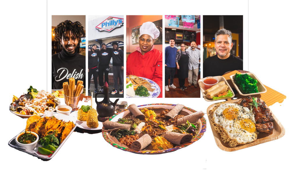
A 2 week-long annual food event promoting independent, BIPOC-owned small businesses in South Seattle.
📙 14+ years history
🛍️ 30+ participating vendors
🕒 Late March to early April
🍽️ Exclusive “Plate of Nations Plates” sampling the vendor’s best dishes
💼 Run by MLK Business Association and sponsored by Amazon, etc.
THE PLATE OF NATIONS WEBSITE
The most essential component to success
Asides from marketing, the website doubles as an informational, hosting key details such as event dates, participating vendors, menus, attendance instructions, and giveaways. A defunct website means no centralized hub for PON information, making participation next to impossible.
Pre-existing Website
❌ 3 Critical Usability Issues
HYPOTHESIS
Usability issues negatively impacted user retention, user acquisition, and PON’s
brand image, contributing to a low attendee turnout
Usability Testing
To gain insight into how PON’s target users were interacting with the website and confirm if our suspicions were true, we recruited frequent PON attendees, South Seattle natives, and potential attendees (self-proclaimed “foodies” and food festival lovers) for usability testing on the original design.
'I couldn't tell this was for a food festival or street event. I thought this was just encouraging people to try different foods'
Poor Information Architecture
‘I'm worried for people with big hands and fingers... I think it'll be hard for them to accurately click on the map’
Poor Mobile Accessibility
‘I’m not sure where to go’
Poor User Flow and Missing Clear Call to Action
PROBLEM
Primary and secondary research revealed that there is already an abundance of resources. Instead of creating a new solution entirely, we must investigate if, why, and how user needs are not being met with preexisting solutions.
User Persona
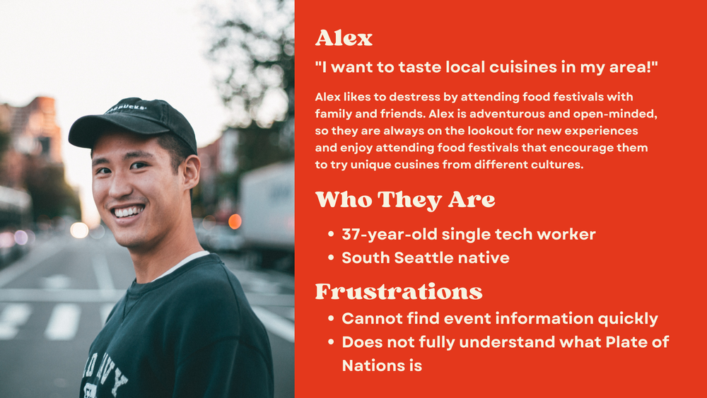
We created the typical Plate of Nations attendee based on our secondary and user research to contextualize target user’s needs, motivations, and behaviors. The user persona served as a baseline check to ensure our design choices were appropriate.
Meet Alex
We defined 3 goals

Mobile Accessibility
Easily navigatable with mobile responsiveness

Linguistic Accessibility
Information can be understood by screen readers and non-native english speakers.

Authentic Cultural Representation
Accurately present cuisines and cultures without stereotyping.
Ideation
Referencing our Market Analysis and Literature Analysis for inspiration
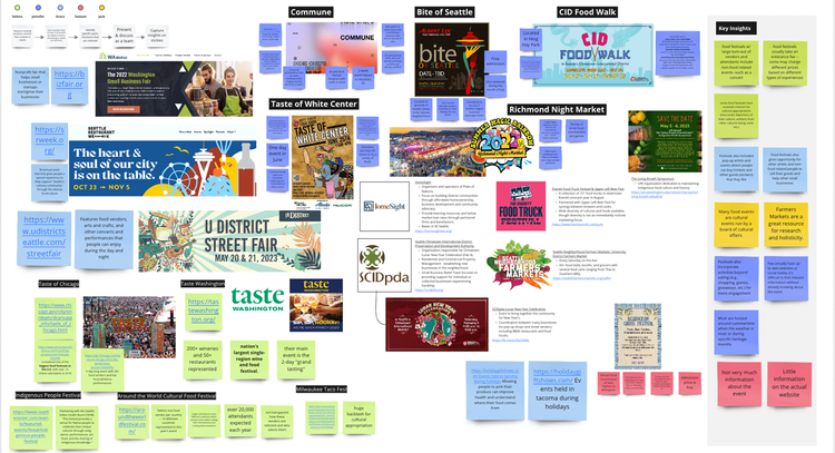
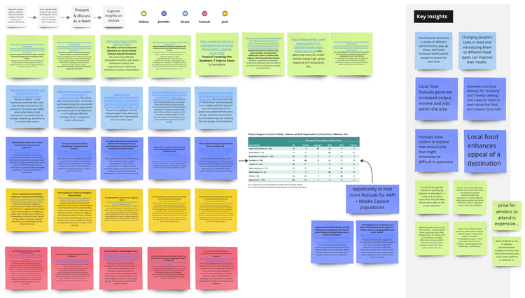
We came up with 25+ ideas!
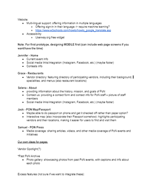
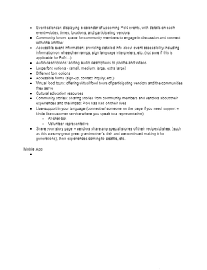
Low Fidelity Prototype
Visualizing our conceptual product
Concept Validation
Based on Low Fidelity Prototype
Color-coded affinity diagrams organized key insights, pain points, and areas of improvement derived or inspired from user feedback
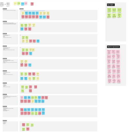
The Good
Users expressed overall approval and excitement for the app!
- Increased visuals and color palette is aesthetically pleasing
- Inviting and playful
- Shifted emphasis on the participating vendors and their owners makes event more enticing
Areas for Growth
Friction in concept’s user flow
- Individual features lack cohesion & a shared purpose
- Certain information not relevant to the event (i.e. too many extra details on “About PON”)
Mid Fidelity Prototype
Iteration 1
Iteration 2
Iteration 3
High Fidelity Prototype
Limitations
High-Fidelity Design vs. JavaScript Capabilities
Javascript’s capabilities were not enough to perfectly reproduce our Figma design. With no time to formally design another iteration of our high-fidelity wireframe to fit Javascript’s extent, the final design was modified throughout development to accomodate.
Limited Technical Skills & Time
Without a specialized back-end developer, our team comprised primarily of UX designers struggled to code a fully-functional passport page that stored & retrieved user’s login and PON passport information from a database. With limited time available, we reduced the scope of the passport page to front-end only.
Key Design Decisions
Less Words, More Visuals
We determined that the website should include more images of the real food and people behind this event to increase user engagement, accessbility, and
For our non-English speaking stakeholder, we kept wording concise and added as many visuals/ icons when possible.
People are often averse to new and unfamiliar experiences. To entice these more reluctant attendees, it was important that we show them the mouthwatering visuals of the cuisines. Seeing the food may change their minds and encourage them to visit vendors.
New Additions: “Meet the Owner” and “About Vendors”
Javascript’s capabilities were not enough to perfectly reproduce our Figma design. With no time to formally design another iteration of our high-fidelity wireframe to fit Javascript’s extent, the final design was modified throughout development to accomodate.
Remove Blue from Color Palette
In an earlier iteration, we introduced blue as an accent color to create more visual interest. However, feedback from PON’s organizers made us realize that a new color isn’t consistent with it’s long established brand identity and it may be hard for returning attendees to recognize. It also risks detracting from the founder’s intentions when they carefully selected the original color palette.
Accessibility for Visually Impaired and Non-English Speakers
PON welcomes everyone. It was imperative that we made our redesign as inclusive of diverse accessibility needs and cultural backgrounds as possible. Our code and web app is accessible to screen readers, including semantic HTML, alternative text to images, and Aria labels. Additionally, the color contrast of our text, design elements, and text size were curated to maximize readability and usability for users. For our non-English speaking audience, we kept wording concise and added as many visuals/ icons when possible.
FINAL REDESIGN
A website that invites
Home
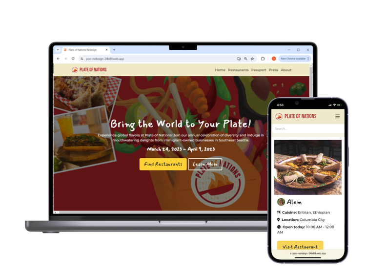
Key event details, such as dates and what PON is, are displayed clearly to users upon navigating to the site. The “Find Restaurants” button is a call to action that inviting users to view participating vendors, encouraging user engagement. Mouthwatering images of cuisines, colorful imagery of food, and images of real PON attendees intrigues and welcomes users to attend PON.
Restaurant Catalog
Easily browse and search for this year’s participating restaurants by type of cuisine, location, hours, or name. Instead of presenting users with restaurant logos as search results, we showcase the savory images of the PON sample plates that look too good to resist. Click “Visit Restaurant” to see more information, such as the pricing of plates, what’s included, business hours, the chefs, and the real stories behind each vendor.
A User Flow that’s Seamless
Easy Access
In under a minute, users can find essential information such as event logistics, participating vendors, PON passport, and about PON. Navigation is effortless.
A Mobile Experience just as Beautiful as on Desktop
Dynamic readability
Images, videos, and text are dynamic, ensuring that they fit on all smaller screens. All elements are customized to be easy to read and access on mobile. Even without a desktop, the website is functional, impactful, and smooth.
Final Reflection
Javascript’s capabilities were not enough to perfectly reproduce our Figma design. With no time to formally design another iteration of our high-fidelity wireframe to fit Javascript’s extent, the final design was modified throughout development to accomodate.
Missed the GALA? Watch our pre-recorded video!
Selena Ando
Context
A 20 week Informatics Capstone Project to redesign Plate of Nation’s website experience
Deliverables
User Persona
Affinity Diagram Maps
Low to High Fidelity Wireframes
High Fidelity Prototype
MVP
Video Presentation
Tools & Concepts
Figma
Visual Studio: Javascript, HTML, CSS
Canva
Miro
Zoom
Accolades
Best Design Award Finalist @ 2023 iSchool Capstone Gala
Problem Context
South Seattle’s Small, BIPOC Business Owners Face Disproportionate Hurdles to Success
South Seattle is a melting pot of cultures and is the home to many BIPOC-owned small businesses, particularly restaurants and cafes.
Literature analysis and stakeholder interviews revealed that these businesses experience a unique set of additional challenges compared to their counterparts, making it disproportionately harder for them to continue operating, putting the representation of local diversity and culture at risk.
Language Barriers
Grants & Funding Inaccessibility
Resource Inacessibility
Inadequate COVID-19 Relief
Fortunately, an egg-celent solution already exists: Plate of Nations (PON)
A 2 week-long annual food event promoting independent, BIPOC-owned small businesses in South Seattle.
📙 14+ years history
🛍️ 30+ participating vendors
🕒 Late March to early April
🍽️ Exclusive “Plate of Nations Plates” sampling the vendor’s best dishes
💼 Run by MLK Business Association and sponsored by Amazon, etc.
THE PLATE OF NATIONS WEBSITE
The most essential component to success
Asides from marketing, the website doubles as an informational, hosting key details such as event dates, participating vendors, menus, attendance instructions, and giveaways. A defunct website means no centralized hub for PON information, making participation next to impossible.
Pre-existing Website
❌ 3 Critical Usability Issues
HYPOTHESIS
Usability issues negatively impacted user retention, user acquisition, and PON’s brand image, contributing to a low attendee turnout
Usability Testing
To gain insight into how PON’s target users were interacting with the website and confirm if our suspicions were true, we recruited frequent PON attendees, South Seattle natives, and potential attendees (self-proclaimed “foodies” and food festival lovers) for usability testing on the original design.
'I couldn't tell this was for a food festival or street event. I thought this was just encouraging people to try different foods'
Poor Information Architecture
‘I'm worried for people with big hands and fingers... I think it'll be hard for them to accurately click on the map’
Poor Mobile Accessibility
‘I’m not sure where to go’
Poor User Flow and Missing Clear Call to Action
PROBLEM
Primary and secondary research revealed that there is already an abundance of resources. Instead of creating a new solution entirely, we must investigate if, why, and how user needs are not being met with preexisting solutions.
User Persona
We created the typical Plate of Nations attendee based on our secondary and user research to contextualize target user’s needs, motivations, and behaviors. The user persona served as a baseline check to ensure our design choices were appropriate.
Meet Alex
We defined 3 goals
Mobile Accessibility
Easily navigatable with mobile responsiveness
Linguistic Accessibility
Information can be understood by screen readers and non-native english speakers.
Authentic Cultural Representation
Accurately present cuisines and cultures without stereotyping.
Ideation
Referencing our Market Analysis and Literature Analysis for inspiration
We came up with 25+ ideas!
Low Fidelity Prototype
Visualizing our conceptual product
Concept Validation
Based on Low Fidelity Prototype
Color-coded affinity diagrams organized key insights, pain points, and areas of improvement derived or inspired from user feedback
The Good
Users expressed overall approval and excitement for the app!
- Increased visuals and color palette is aesthetically pleasing
- Inviting and playful
- Shifted emphasis on the participating vendors and their owners makes event more enticing
Areas for Growth
Friction in concept’s user flow
- Individual features lack cohesion & a shared purpose
- Certain information not relevant to the event (i.e. too many extra details on “About PON”)
Mid Fidelity Prototype
Iteration 1
Iteration 2
Iteration 3
High Fidelity Prototype
Limitations
High-Fidelity Design vs. JavaScript Capabilities
Javascript’s capabilities were not enough to perfectly reproduce our Figma design. With no time to formally design another iteration of our high-fidelity wireframe to fit Javascript’s extent, the final design was modified throughout development to accomodate.
Limited Technical Skills & Time
Without a specialized back-end developer, our team comprised primarily of UX designers struggled to code a fully-functional passport page that stored & retrieved user’s login and PON passport information from a database. With limited time available, we reduced the scope of the passport page to front-end only.
Key Design Decisions
Less Words, More Visuals
We determined that the website should include more images of the real food and people behind this event to increase user engagement, accessbility, and
For our non-English speaking stakeholder, we kept wording concise and added as many visuals/ icons when possible.
People are often averse to new and unfamiliar experiences. To entice these more reluctant attendees, it was important that we show them the mouthwatering visuals of the cuisines. Seeing the food may change their minds and encourage them to visit vendors.
New Additions: “Meet the Owner” and “About Vendors”
Remove Blue from Color Palette
In an earlier iteration, we introduced blue as an accent color to create more visual interest. However, feedback from PON’s organizers made us realize that a new color isn’t consistent with it’s long established brand identity and it may be hard for returning attendees to recognize. It also risks detracting from the founder’s intentions when they carefully selected the original color palette.
Accessibility for Visually Impaired and Non-English Speakers
Javascript’s capabilities were not enough to perfectly reproduce our Figma design. With no time to formally design another iteration of our high-fidelity wireframe to fit Javascript’s extent, the final design was modified throughout development to accomodate.
FINAL REDESIGN
A website that invites
Home
Key event details, such as dates and what PON is, are displayed clearly to users upon navigating to the site. The “Find Restaurants” button is a call to action that inviting users to view participating vendors, encouraging user engagement. Mouthwatering images of cuisines, colorful imagery of food, and images of real PON attendees intrigues and welcomes users to attend PON.
Restaurant Catalog
Easily browse and search for this year’s participating restaurants by type of cuisine, location, hours, or name. Instead of presenting users with restaurant logos as search results, we showcase the savory images of the PON sample plates that look too good to resist. Click “Visit Restaurant” to see more information, such as the pricing of plates, what’s included, business hours, the chefs, and the real stories behind each vendor.
A User Flow that’s Seamless
Easy Access
In under a minute, users can find essential information such as event logistics, participating vendors, PON passport, and about PON. Navigation is effortless.
A Mobile Experience just as Beautiful as on Desktop
Dynamic readability
Images, videos, and text are dynamic, ensuring that they fit on all smaller screens. All elements are customized to be easy to read and access on mobile. Even without a desktop, the website is functional, impactful, and smooth.
Final Reflection
Javascript’s capabilities were not enough to perfectly reproduce our Figma design. With no time to formally design another iteration of our high-fidelity wireframe to fit Javascript’s extent, the final design was modified throughout development to accomodate.
Missed the GALA? Watch our pre-recorded video!
Selena Ando
Context
A 20 week Informatics Capstone Project to redesign Plate of Nation’s website experience
Tools & Concepts
Figma
Visual Studio: Javascript, HTML, CSS
Canva
Miro
Zoom
Deliverables
User Persona
Affinity Diagram Maps
Low to High Fidelity Wireframes
High Fidelity Prototype
MVP
Video Presentation
Accolades
Best Design Award Finalist @ 2023 iSchool Capstone Gala
Problem Context
South Seattle’s Small, BIPOC Business Owners Face Disproportionate Hurdles to Success
South Seattle is a melting pot of cultures and is the home to many BIPOC-owned small businesses, particularly restaurants and cafes.
Literature analysis and stakeholder interviews revealed that these businesses experience a unique set of additional challenges compared to their counterparts, making it disproportionately harder for them to continue operating, putting the representation of local diversity and culture at risk.
Language Barriers
Grants & Funding Inaccessibility
Resource Inaccessibility
Inadequate COVID-19 Relief
Fortunately, an egg-celent solution already exists: Plate of Nations (PON)
A 2 week-long annual food event promoting independent, BIPOC-owned small businesses in South Seattle.
📙 14+ years history
🛍️ 30+ participating vendors
🕒 Late March to early April
🍽️ Exclusive “Plate of Nations Plates” sampling the vendor’s best dishes
💼 Run by MLK Business Association and sponsored by Amazon, etc.
THE PLATE OF NATIONS WEBSITE
The most essential component to success
Asides from marketing, the website doubles as an informational, hosting key details such as event dates, participating vendors, menus, attendance instructions, and giveaways. A defunct website means no centralized hub for PON information, making participation next to impossible.
Pre-existing Website
❌ 3 Critical Usability Issues
HYPOTHESIS
Usability issues are negatively impacted user retention, user acquisition, and PON’s brand image, contributing to a low attendee turnout
Usability Testing
To gain insight into how PON’s target users were interacting with the website and confirm if our suspicions were true, we recruited frequent PON attendees, South Seattle natives, and potential attendees (self-proclaimed “foodies” and food festival lovers) for usability testing on the original design.
'I couldn't tell this was for a food festival or street event. I thought this was just encouraging people to try different foods'
Poor Information Architecture
‘I'm worried for people with big hands and fingers... I think it'll be hard for them to accurately click on the map’
Poor Mobile Accessibility
‘I’m not sure where to go’
Poor User Flow and Missing Clear Call to Action
PROBLEM
How might the Plate of Nations website be made more accessible so that more attendees will participate in the event?
User Persona
We created the typical Plate of Nations attendee based on our secondary and user research to contextualize target user’s needs, motivations, and behaviors. The user persona served as a baseline check to ensure our design choices were appropriate.
Meet Alex
We defined 3 goals
Mobile Accessibility
Easily navigable with mobile responsiveness.
Linguistic Accessibility
Information can be understood by screen readers and non-native English speakers.
Authentic Cultural Representation
Accurately present cuisines and cultures without stereotyping.
Ideation
Referencing our Market Analysis and Literature Analysis for inspiration
We came up with 25+ ideas!
Low Fidelity Prototype
Visualizing our conceptual product
Concept Validation
Based on Low Fidelity Prototype
Color-coded affinity diagrams organized key insights, pain points, and areas of improvement derived or inspired from user feedback
The Good
Users expressed overall approval and excitement for the app!
- Increased visuals and color palette is aesthetically pleasing
- Inviting and playful
- Shifted emphasis on the participating vendors and their owners makes event more enticing
Areas for Growth
Friction in concept’s user flow
- Individual features lack cohesion & a shared purpose
- Certain information not relevant to the event (i.e. too many extra details on “About PON”)
Mid Fidelity Prototype
Iteration 1
Iteration 2
Iteration 3
High Fidelity Prototype
Limitations
High-Fidelity Design vs. JavaScript Capabilities
Javascript’s capabilities were not enough to perfectly reproduce our Figma design. With no time to formally design another iteration of our high-fidelity wire-frame to fit Javascript’s extent, the “final” design was modified throughout development to accommodate. As we changed our design, maintaining functionalities was of utmost importance.
Limited Technical Skills & Time
Without a specialized back-end developer, our team comprised primarily of UX designers struggled to code a fully-functional passport page that stored & retrieved user’s login and PON passport information from a database. With limited time available, we reduced the scope of the passport page to front-end only.
Key Design Decisions
Less Words, More Visuals
To increase user engagement and accessibility for our target audience, we prioritized adding visuals of real attendees and PON sample meals. For our audience who frequent food festivals like our user persona, we recognized that they may be a bit averse to new, unfamiliar experience. By adding photographs of previous attendees and sample sets, we are able to make the event more approachable.
New Additions: “Meet the Owner” and “About Vendors”
Each vendor’s information page features the owners and their story behind their establishment and their dishes. Curious attendees can inform and immerse themselves in each vendor’s culture, creating a stronger connection with the cooks and their food. These attachments are what drive attendees to come back long after the PON event concludes.
Remove Blue from Color Palette
In an earlier iteration, we introduced blue as an accent color to create more visual interest. However, feedback from PON’s organizers made us realize that a new color isn’t consistent with it’s long established brand identity and it may be hard for returning attendees to recognize. It also risks detracting from the founder’s intentions when they carefully selected the original color palette.
Accessibility for Visually Impaired and Non-English Speakers
PON welcomes everyone. It was imperative that we made our redesign as inclusive of diverse accessibility needs and cultural backgrounds as possible. Our code and web app is accessible to screen readers, including semantic HTML, alternative text to images, and Aria labels. Additionally, the color contrast of our text, design elements, and text size were curated to maximize readability and usability for users. For our non-English speaking audience, we kept wording concise and added as many visuals/ icons when possible.
FINAL REDESIGN
A website that invites
Home
Key event details, such as dates and what PON is, are displayed clearly to users upon navigating to the site. The “Find Restaurants” button is a call to action that inviting users to view participating vendors, encouraging user engagement. Mouthwatering images of cuisines, colorful imagery of food, and images of real PON attendees intrigues and welcomes users to attend PON.
Restaurant Catalog
Easily browse and search for this year’s participating restaurants by type of cuisine, location, hours, or name. Instead of presenting users with restaurant logos as search results, we showcase the savory images of the PON sample plates that look too good to resist. Click “Visit Restaurant” to see more information, such as the pricing of plates, what’s included, business hours, the chefs, and the real stories behind each vendor.
A User Flow that’s Seamless
Easy Access
In under a minute, users can find essential information such as event logistics, participating vendors, PON passport, and about PON. Navigation is effortless.
A Mobile Experience just as Beautiful as on Desktop
Dynamic readability
Images, videos, and text are dynamic, ensuring that they fit on all smaller screens. All elements are customized to be easy to read and access on mobile. Even without a desktop, the website is functional, impactful, and smooth.
Final Reflection
Without a specialized back-end developer, our team comprised primarily of UX designers struggled to code a fully-functional passport page that stored & retrieved user’s login and PON passport information from a database. With limited time available, we reduced the scope of the passport page to front-end only.
Missed the GALA? Watch our pre-recorded video!